Manual Redesign / Poster Design
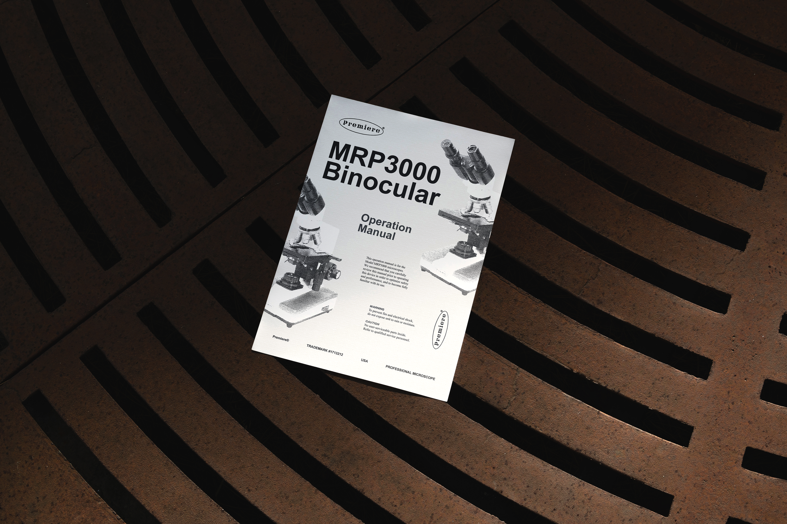
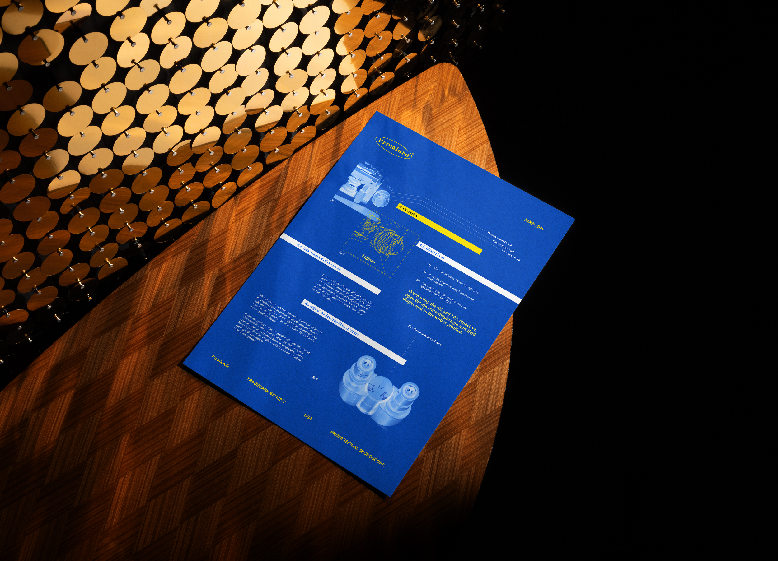
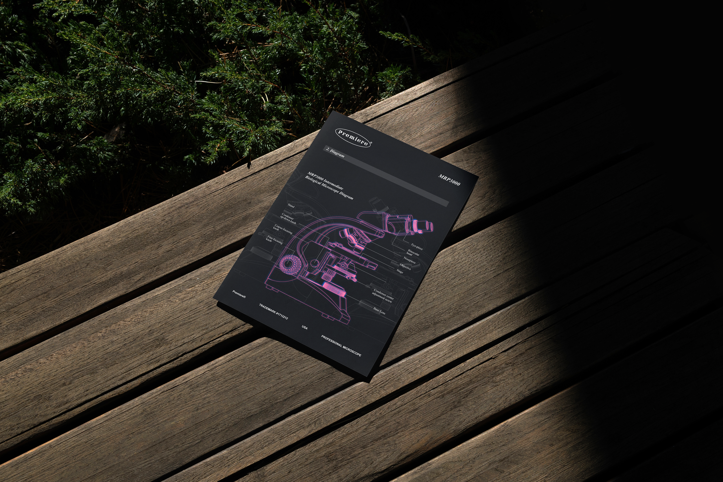
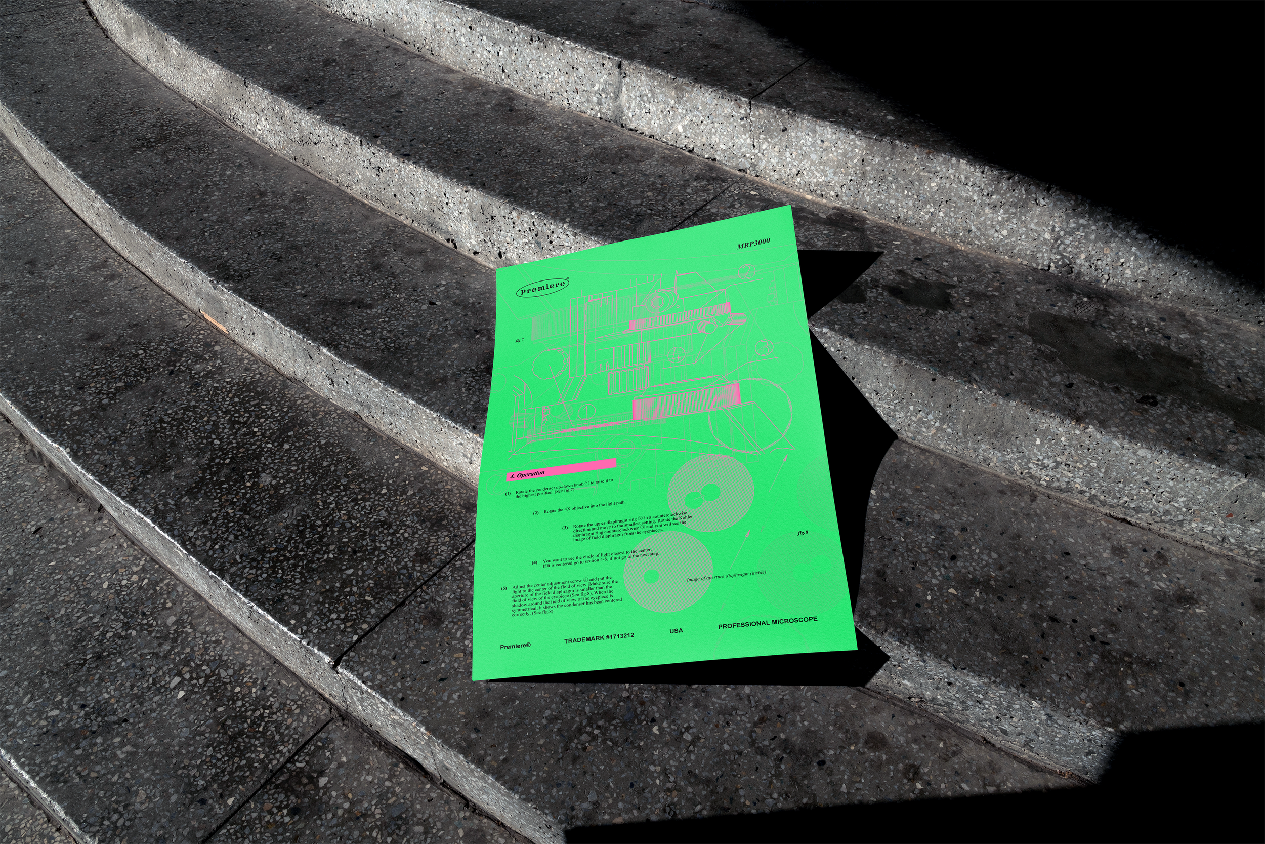
We interact with instructional information daily, whether it’s a manual for assembling furniture, a guide on how to use a coffee machine, or safety instructions on an airplane, yet most of it feels dull and uninspired. From manuals to signage, these instructions often rely on basic typography, simple diagrams, and rudimentary visuals to convey their message. However, even the most ordinary instructional design has untapped creative potential—an opportunity to transform functional content into something more engaging and visually compelling. The challenge is to create something really visually interesting and inspiring without changing anything original, using the original typefaces and graphics. I experimented with various compositions and color combinations while maintaining a structured grid layout.
It’s always important to let your ingenuity and creative thinking push you to play, and explore unconventional ideas!
*Link to original manual here.
Project Type
Personal project / typography
Designer
Esther Wong